We build Next.js, Shopify, Laravel, Flutter, in Noida, India. Free 1-page audit, no obligation.
Get a free quote- Manufacturing Software for Indian MSMEs Industry 4.0 GuideAugust 22, 2026
- Top Healthcare IT Solutions Improving Patient ExperienceAugust 12, 2026
- Top IT Solutions Transforming Financial Services in 2026August 10, 2026
- Website Development Cost in India in 2026 | Complete Pricing GuideAugust 4, 2026
- The logo problem is a file problem before it is a taste problem
- The trademark trap nobody mentions until it is too late
- Report design is not decoration, it is the difference between read and skimmed
- The two jobs are connected
- What this costs in India, honestly
- Questions worth asking before you commission either
- If you already have a logo you are not sure about
 Design
Logo Design and Report Design: What Indian Businesses Get Wrong
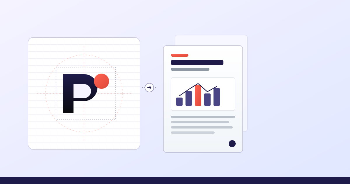
Two design jobs come up constantly and get treated as afterthoughts: the logo, and the annual or investor report. They look unrelated. They fail for the same reason, which is that both get commissioned as a picture when what is actually needed is a system.
The symptom is familiar. A business has a logo, but the only file anyone can find is a JPEG with a white box behind it, so the signboard vendor rebuilds it by eye and the version on the invoice is subtly different from the one on the website. Or the annual report exists, but it is a Word document exported to PDF, the charts came out of Excel with default colours, and the pages that mattered most are the ones nobody read.
Both are cheaper to prevent than to fix. Here is what goes wrong specifically, and what you should be receiving.
The logo problem is a file problem before it is a taste problem
Most conversations about logos are about whether people like it. That matters, but it is rarely what causes the expensive problems a year later. Those come from what you were handed.
A logo is not one image. It is a small set of related artwork that has to survive every place your business appears, and those places have contradictory requirements. A signboard needs artwork in CMYK with the type outlined, because the fabricator does not have your font and a substituted one changes the letterforms. A favicon needs the mark legible at sixteen pixels, which usually means dropping detail rather than shrinking it. An Instagram profile crops to a circle and will cut the corners off a wordmark. A single-colour rubber stamp needs a version with no gradients at all.
If you were given a JPEG, none of those exist yet, and each one will get improvised later by whoever is closest to the deadline. That is how a brand ends up with four slightly different logos in circulation and nobody able to say which is correct.
What a logo handover should actually contain
- Layered vector source in AI and SVG. This is the master. Everything else is exported from it.
- Print-ready EPS and PDF, in CMYK, with type outlined so no font substitution is possible.
- PNG exports at the sizes you use, including favicon and app icon crops.
- Horizontal, stacked, and icon-only lock-ups, because a wide header and a square avatar cannot use the same arrangement.
- A monochrome version that works in one colour, for stamps, faxed forms, and single-colour printing.
- A reversed version for dark backgrounds and dark-mode interfaces.
- A short usage note covering clear space, minimum size, and the specific misuses that ruin the mark.
That list is not a premium upsell. It is the minimum for a mark you can actually use, and producing it while the logo is being designed costs almost nothing extra. Reconstructing it eighteen months later from a JPEG means redrawing the whole thing.
The trademark trap nobody mentions until it is too late
A large share of cheap logos are assembled from stock icon libraries. The designer buys a licence, drops the icon next to your company name, and delivers. It looks fine. The problem surfaces when you try to register the mark.
You generally cannot claim exclusive rights over an element that is licensed to thousands of other buyers, several of whom may be in your category. Depending on the filing this shows up as an objection, or it shows up later when someone else uses a mark that is legitimately almost identical to yours, and you discover you have no standing to object.
This is worth checking before you spend anything on signage or packaging. Ask directly: is every element of this mark original work, and can I have that in writing? A designer doing original work will answer immediately. If the answer involves the word licence, you are buying a decoration rather than an asset.
Two practical notes. Attorneys usually want a clean monochrome vector for the filing, so make sure that file exists. And if your brand operates in two scripts, for example an English and a Tamil or Hindi wordmark, those are commonly treated as separate marks and each needs its own artwork prepared.
Report design is not decoration, it is the difference between read and skimmed
Annual reports, investor updates, ESG disclosures, and research reports have a specific failure mode. The content is genuinely good, the effort that went into gathering it was real, and almost nobody reads past page four.
That is usually a structure problem rather than a beauty problem. A report written as a linear document assumes the reader starts at the beginning and continues. Almost no one does. Investors go to the numbers. Journalists go to whatever is quotable. A prospective client goes to the case study. If the document has no way to enter it except at page one, all three give up.
What actually changes whether a report gets read
- A real hierarchy, so someone scanning gets the argument from headings and pull quotes alone without reading a paragraph.
- Charts built to answer a question, not to display a spreadsheet. One point per chart, labelled directly, no legend hunting.
- Consistent number formatting throughout. Mixing lakh and million across sections quietly destroys credibility with exactly the readers you wrote it for.
- A summary page that works as a standalone artefact, because it is the page that gets screenshotted and forwarded.
- Page furniture that tells you where you are, so a reader landing in the middle from a link is not lost.
- Print production done properly if it is going to print, meaning CMYK, bleed, and a proof before the run.
Charts deserve their own warning. Excel and Google Sheets defaults are designed to be neutral, not to communicate. Default palettes frequently fail colour-blind readers, three-dimensional bars distort the values they display, and pie charts with more than four slices are essentially decoration. Rebuilding the charts is often the single change that most improves a report.
The two jobs are connected
Here is why these belong in one article. The report is where a brand identity is tested hardest, and where most identities fail.
A logo and two brand colours are enough for a website header. They are not enough for an eighty-page document, which needs a heading scale, a table style, chart colours that work in sequence and in comparison, a caption style, a rule for pull quotes, and a decision about what happens on a page that is mostly numbers. If those were never defined, the person laying out the report invents them under deadline, and the result does not look like the rest of your business.
This is what a brand system means in practice, and it is why identity work is more than a logo. Not a fifty-page brand bible nobody opens. A working set of decisions: the type scale, the colour roles including which colour means what in a chart, the spacing rhythm, and how the mark behaves when there is no room for it.
What this costs in India, honestly
Figures we quote in 2026, so you have a reference point rather than a range wide enough to be useless.
- Original logo, three distinct routes, two revision rounds, full source files: ₹15,000 to ₹30,000.
- Logo plus a basic brand guide covering colour, type, and usage: ₹30,000 to ₹50,000.
- Full identity system with layout rules and templates: ₹50,000 to ₹1,00,000.
- Bilingual lock-up set where the second script is drawn rather than typed: add ₹15,000 to ₹25,000.
- Annual or investor report design, twenty-five to sixty pages, including chart rebuild: ₹60,000 to ₹2,00,000 depending on page count and how much of the data needs restructuring.
- Report template you can reuse next year without us: ₹40,000 to ₹90,000.
The template option is worth considering if you produce a report every year. The first year costs more than a one-off layout. Every year after that costs a fraction, because the system already exists and only the content changes.
Questions worth asking before you commission either
- Is every element original, and will you confirm that in writing? Relevant to trademark, and the answer should be immediate.
- What exactly will I receive? Ask for the file list. If it does not include vector source, keep asking.
- Who owns it after final payment? Ownership should transfer outright, not be licensed to you.
- Can I see it at sixteen pixels and on a signboard mock-up? Most marks fail one of those two, and it is better to find out during design.
- For a report: will the charts be rebuilt or placed as supplied? Placing Excel exports is layout, not design, and should not be priced as design.
- Will I get an editable template, or only a flattened PDF? This determines whether next year is cheap or a repeat of this year.
If you already have a logo you are not sure about
The instinct is to redesign. Usually that is the wrong call, and we say so regularly enough that it is worth writing down.
If customers recognise your mark, that recognition took years and money to build and throwing it away to look more current is an expensive trade. The productive version is a rebuild rather than a redesign: redraw it properly in vector, correct the spacing and proportions that were never right, produce a version that survives small sizes, and define the colour and type system that was never written down. You keep everything your customers already know and fix everything that was actually causing problems.
A genuine redesign makes sense when the business has changed enough that the mark now misrepresents it, when the mark cannot be trademarked because of how it was made, or when it is so close to a competitor's that it causes real confusion. Those are three specific reasons. Wanting something fresher is not usually one of them.
Send us the logo files you currently have and we will tell you honestly whether you need a redesign, a rebuild, or nothing at all.
Get an honest opinionFrequently asked questions
How much does a professional logo cost in India?
What files should I receive with a logo?
Can I trademark a logo made from stock icons?
Why do our annual reports never get read past the first few pages?
Should we redesign our existing logo or keep it?
Is it worth paying to rebuild the charts in a report?
Founder of buildbyravirai, a web development agency based in Noida, India. 5+ years shipping Next.js, WordPress, Shopify, and Laravel projects for clients in India, USA, Canada, and the UK.
Working with us in your city
Keep Reading
 Guides
Website Security for Indian Businesses 2026: The Basics That Actually Stop Most Attacks
The plain-language guide to website security basics for Indian business owners in 2026: what actually attacks your site, and the few things that protect it.
 SEO
SEOHow to Rank #1 on Google Maps for Your City in 2026: The Local SEO Playbook for Indian Businesses
When someone searches "[your service] near me" or "[your service] in [your city]", do you show up in the top 3 on the map? Or are you invisible to a customer who's ready to buy right now? Ranking in the Google Maps 'map pack' is more achievable than you think, and most of your local competitors haven't done the basics. This is the step-by-step playbook.
SEO11 SEO Mistakes Indian Small Businesses Make in 2026, And the Quick Fixes That Actually Bring Clients Back
If your website used to bring leads but doesn't anymore, 11 SEO mistakes account for ~90% of the cases we see. The honest checklist, with the exact fix for each.
 Guides
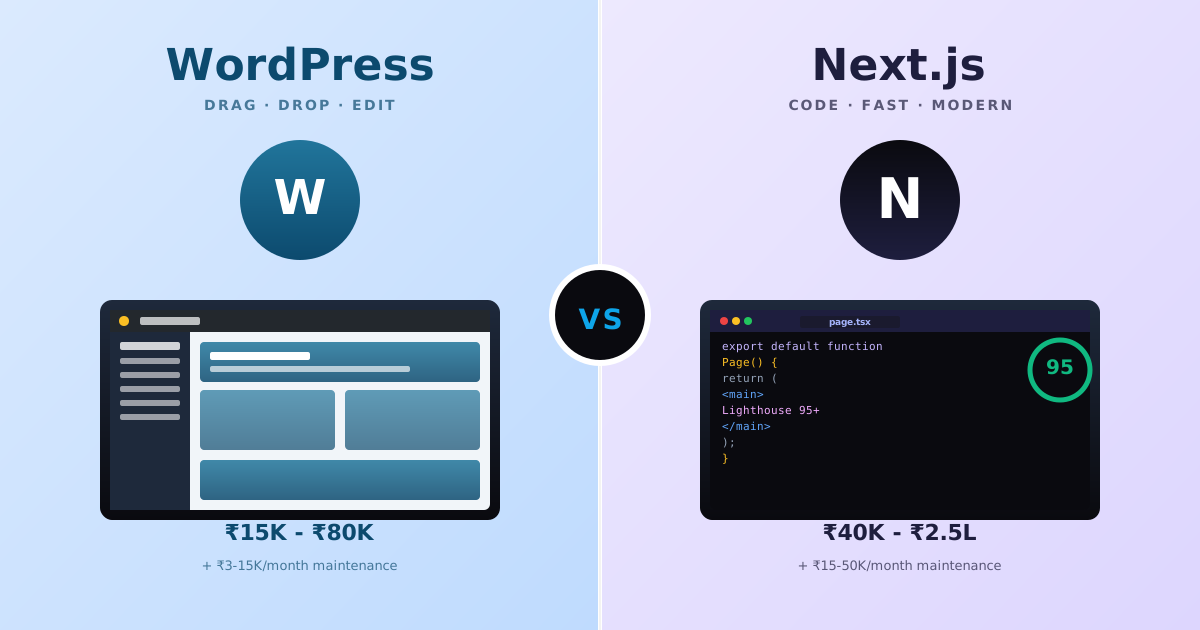
WordPress vs Next.js for Indian Small Businesses (2026): When Each Wins, Real INR Costs, and the 8 Hidden Trade-offs
Indian founders keep asking the wrong question, "WordPress or Next.js?", when the real question is what each stack actually solves for a ₹50K-2L budget, who edits content, and what breaks 18 months later. Real INR pricing, the 8 hidden trade-offs, and a decision matrix by business + team type.
 Guides
What We Actually Fix When Indian Businesses Hire Us to Rebuild Their Website (8 Patterns from 30+ Rescue Projects)
Indian founders hire us to rebuild their website for one of 8 reasons, every single time. Here are the exact 8 patterns we see, the real fixes, and what each costs.